05 Feb 2022
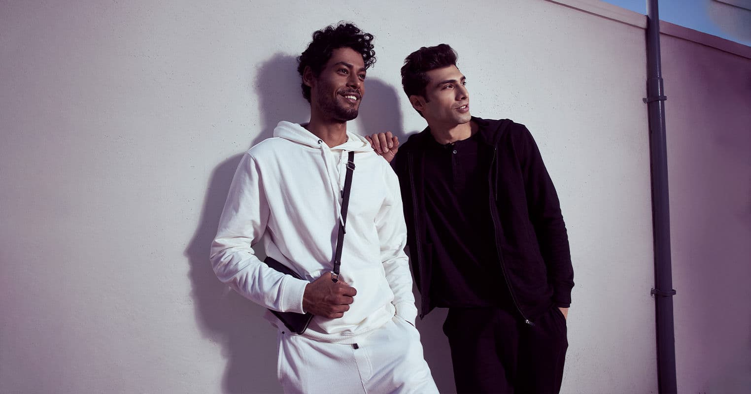
A Monochromatic Harmony : Coords For Men
If you haven’t heard of co-ord sets, chances are you are stuck in 2018. Whatever the case may be, we are here to help you change that! But hey, that was a long time ago, no?
To be exaggerating (or not), co-ords solve the age-old problem of “what to wear and how to pair” when the real struggle was “I can’t find anything to pair with my green pants” *cues cry for help*.
Enter co ord sets – with their single colour/print elegance, their I-don’t-need-an-outsider outlook, and their sheer simplicity.
Co-ord sets: Versatility without so much versatility
Co-ord sets in India are known to be versatile, classy and effortless in every way possible. This makes the set stand out due to their simple, monotone colours that flow together. Adding this ecstatic style automatically generates a class apart.
Why is everyone obsessed with co-ord outfits?
Any man that loves style knows that fabric and fit matter the most for any well-put-together ensemble. And yet, sometimes more important is colour, and more particularly how you coordinate and match different hues within your look for co ords outfit. If you ever saw an influencer/model and wondered how their outfits look so good, it’s because they pay close attention to these three areas of style.
Similarly, your favourite brand or designer may also follow these few basic rules of colour theory in order to produce collections that look and feel good to the buyer. It’s the same process followed by interior designers, artists, car manufacturers and across almost all areas of product design.
Factors to Consider when Picking co-ord sets for men
The Colour Wheel
To identify differences and similarities between colours when choosing your co ord sets for men
Colour harmony
How to pair two or more colours based co ord sets for men on a variety of key formulas.
It sounds more complicated than it is. There are simple guidelines to follow that you can work with. Read on to learn more about how we colour match and methods in which a cohesive outfit can be coordinated.
Tips to match the cohesive colour for co-ord outfit
Remember the good old acronym VIBGYOR we all were taught in school? So, accordingly, the natural order of colour is red, orange, yellow, green, blue, indigo, and violet. If we take this colour wheel on face value, the most common theory suggests matching opposites. Blue with orange, for example, or green with red. But in reality, and (visually), these pairings are likely to be too much. Hence, it becomes crucial to consider hue, saturation and brightness, to create a harmonious and cohesive palette.
Combining colours can get quite tricky, but your overall aim is to combine contrast cohesively. It sounds contradictory but the contrast makes your outfit appear more interesting, and marrying colours in the right palette creates cohesion. Think of it as creating a ‘theme’ of colours, if you will, optimised by varying the hue, saturation and brightness levels of each colour in the palette.
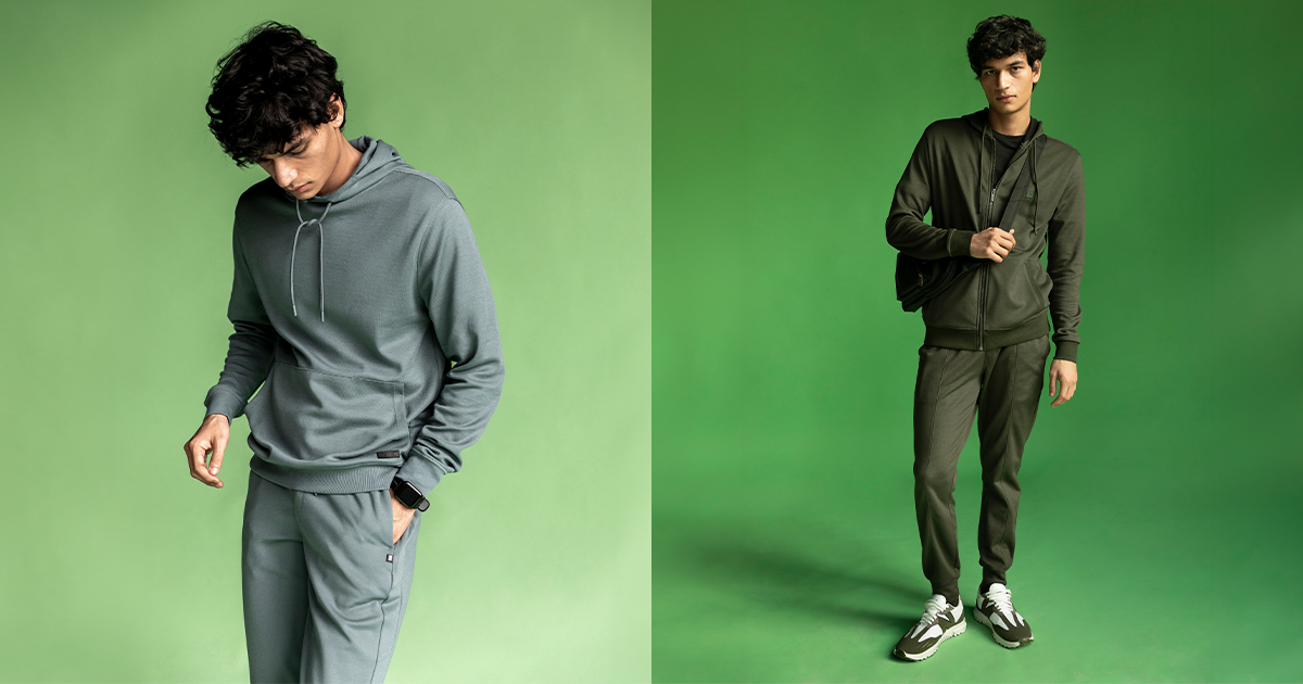
Moving on with Co-ord sets for men
Vacation or not, you gotta lounge in style. These co ord sets for men are the ‘IT’ co ord sets when you just want to keep minimal and yet slay the look. The colours of a monochromatic palette have a single hue but vary in brightness and saturation.
It’s wise to pick colours to suit your skin tone and the occasion. The right half of the wheel is “warm” and ideal for spring/summer whereas the left side of the wheel is “cool” and better suited to autumn/winter. Although, of course, this isn’t a hard and fast rule. And don’t forget, you can always seamlessly combine all three colour rules above with grey, black and white.
Finally, don’t take these guidelines too literally. For instance, buying bold blue trousers and combining them with a bold orange T-shirt would check the box of colour matching appropriately. But you must consider all three points – hue, saturation and brightness – for a more ‘civilised’ or toned-down approach to blue and orange. We aren’t peacocks, after all. Always give yourself the “mirror check” before you leave the house, and if you want to wear a particularly colourful piece of clothing – an orange sweatshirt or green chinos, for example – start with this item and then colour match back using the theories above.
RELATED: How to style joggers??
Similarly, you can play it safe with a neutral colour base and then add a highlight colour to introduce a splash of colour/design. The navy two-piece with red tie outfit above is a good example, with the navy suit being a staple of any man’s wardrobe.